Why “complex image tasks” break traditional computer vision pipelines
A detector can tell you there’s a “button” in a UI screenshot, a “bar” in a chart, or a “signature” on a form. The task that breaks pipelines is what comes after: which button should be clicked to change billing, whether the bar implies growth after adjusting for a missing legend, or whether the signature is on the right line.
Traditional computer vision stacks solve this by chaining models plus rules: detect, OCR, parse layout, match templates, then run brittle heuristics. Each step is locally reasonable but errors compound, and small visual changes (new theme, rotated scan, different chart style) invalidate assumptions.
You keep shipping patches for edge cases, and latency grows as you add more stages and retries.
What visual reasoning models actually add beyond seeing objects
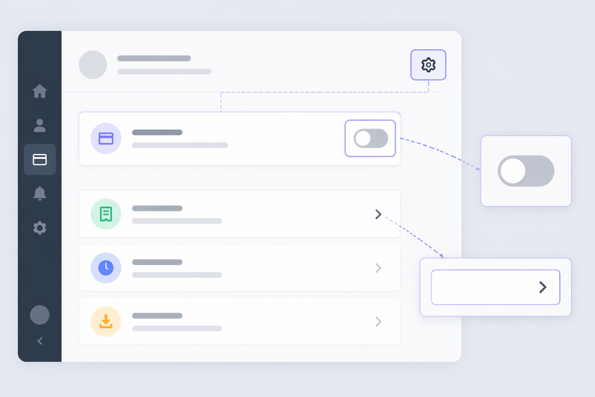
In a UI screenshot, a visual reasoning model doesn’t just label “button” and “text.” It can connect the label “Billing” to the nearby settings icon, infer that a greyed-out toggle is disabled, and answer “which control changes the plan?” because it’s modeling relationships, not just regions. In a chart, it can tie axis labels, legend colors, and bar heights into a single interpretation, then compare two series and explain the trend in plain language.
The useful leap is multi-step grounding: read text, align it to the right visual element, apply a constraint (“choose the one that updates payment method”), and produce an action or explanation. That said, it’s not free accuracy. These models can hallucinate when the image is low-resolution, when text is tiny, or when the question is underspecified—and they cost more per request and usually run slower than a detector-plus-OCR stage.
Choosing the right approach: one big model or a hybrid stack
A common decision point is whether to hand the whole problem to a single visual reasoning model (“read the screenshot, decide what to do, explain why”) or to keep a hybrid stack where specialized components do the easy parts. The “one big model” route is simplest to integrate and often wins when the task is open-ended: messy documents, varied charts, or UI flows that change often. It also reduces the number of brittle glue assumptions between stages, which is where many pipeline failures hide.
A hybrid approach can be better when you can formalize sub-tasks and you need predictable behavior: run OCR and layout first, then pass extracted text plus cropped regions to a reasoning model for the final decision. This usually cuts latency and cost, and it gives you intermediate artifacts to debug. Every preprocessor has its own failure modes, and a “clean” OCR output is not guaranteed on low-quality scans or small-font UIs.
In practice, teams land on a default: use classic CV for high-confidence, repeatable primitives (text extraction, barcode/QR, template matches), and reserve reasoning calls for the last mile where relationships, constraints, and multi-step choices dominate.
The input matters: images, context, and prompts that steer reasoning
Most failures you’ll see in visual reasoning are input failures first. A screenshot that looks “readable” to a person may still have tiny fonts, compression artifacts, or scaling that turns key labels into noise. Simple moves—higher resolution captures, avoiding aggressive JPEG, keeping the full frame instead of tight crops—often improve accuracy more than swapping models, because the model can only ground what it can actually resolve.
Context does real work. “Find the billing button” is different from “change the payment method without upgrading the plan,” and the model needs that constraint to disambiguate similar controls. When you have it, provide user intent, allowed actions, and any known UI state (“currently on Settings,” “enterprise account,” “toggle must stay off”). Without it, you’re asking the model to guess business logic from pixels.
Prompts should be operational, not poetic: request a short answer plus evidence (“quote the on-screen text you used”), require coordinates or element descriptions, and define what to do when uncertain (“respond ‘cannot determine’ if text is unreadable”). The cost is that longer prompts and higher-res images raise latency and spend, so teams usually standardize a few prompt templates rather than improvising per feature.
Common complex tasks: charts, documents, UI screenshots, and scenes

You can usually spot “reasoning-worthy” work by the presence of hidden joins. With charts, the hard part isn’t bar detection; it’s mapping colors to the legend, resolving stacked vs. grouped bars, reading footnotes (“excludes returns”), and answering comparisons that require conditional logic (“Which region grew fastest after 2022?”). Models help when they can cite the axis label or legend entry they relied on, not just output a number.
Documents push the same pattern into forms and contracts: associate a value with its field label, follow cross-references (“see section 4.2”), and reconcile conflicting signals (typed name vs. signature block). OCR alone gives text; reasoning is what turns scattered text into “the effective date is X and it appears in the amendment, not the main page.” Low-quality scans and uncommon layouts are still a tax you pay in retries.
UI screenshots are about intent under constraints: “change billing without canceling,” “find where the limit is set,” or “which control is disabled.” Scene images add spatial relationships: “is the fire extinguisher accessible?” or “which box is on top of the labeled crate?” These tasks work best when you can tolerate a calibrated “uncertain” response and build a fallback path.
Reliability and evaluation: how to test reasoning, not vibes
The prototype can feel impressive because it produces fluent explanations, but reliability shows up when you change the image slightly or ask the same question five ways. Start by defining “correct” in a way you can score: the model must point to specific on-screen evidence (quoted text, table cell, legend label) and produce an answer that matches a known label. If you can’t label the task, you can still label sub-claims: “the x-axis says 2022,” “the toggle is disabled,” “the signature is on the tenant line.”
Build eval sets that reflect operational mess: low-res screenshots, rotated scans, theme changes, partial crops, and adversarial near-duplicates (two “Billing” links). Measure not just accuracy, but abstention quality: how often it says “cannot determine” when text is unreadable, and whether uncertainty correlates with errors. A practical constraint is cost—human labeling for grounding and multi-step correctness is slower than box annotation—so teams often focus on the few decision points that drive user harm or support tickets.
Finally, run regression tests on prompts and preprocessing. Small prompt edits can shift behavior, so treat prompts like code, version them, and keep a “golden set” of images to catch silent degradations before they ship.
Shipping in the real world: latency, cost, privacy, and fallbacks
A familiar production surprise is that the “best” reasoning prompt in a notebook is too slow or too expensive at scale. High-resolution images and long context increase token and compute cost, and users notice when a UI assist takes seconds instead of hundreds of milliseconds. Many teams end up tiering: run fast heuristics first (template match, OCR, cached embeddings), then call a reasoning model only when confidence is low or the user’s intent is high-value.
Privacy and data handling shape architecture. Screenshots can contain emails, account numbers, or PHI, so you may need on-device redaction, region-cropping, or a self-hosted model even if quality drops. Fallbacks should be explicit: return coordinates plus evidence when confident, otherwise abstain and route to a simpler flow (ask for a clearer image, confirm with the user, or hand off to human review). Shipping means budgeting for retries, not just accuracy.